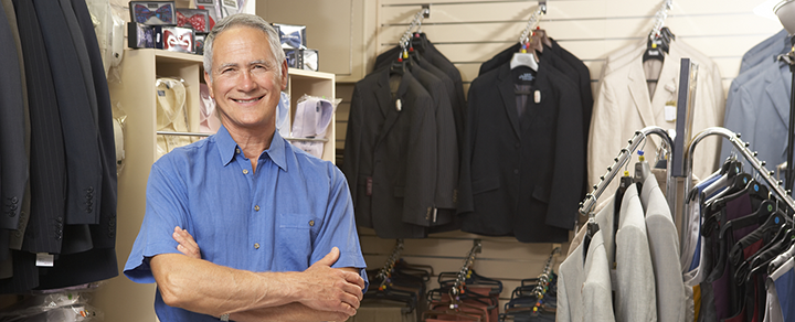
The difference between a bland gridwall panel and an attention-grabbing gridwall panel display is a little creativity. The main purpose of using gridwalls is to maximize space in a cost-effective way. But many retailers aren’t taking full advantage of the structure’s full potential. To attract more customers with your gridwall, apply the following advice from experts at Bargan Store Equipment.
Separate Hanging and Shelving EquipmentAlthough it might sound like a good idea to balance out your design by including a mix of shelves, baskets and hangers on each panel, this strategy can actually limit the storage efficiency and overall aesthetic appeal of the display. The best way to stay organized is to carefully segregate your gridwall accessories.
For example, hanging accessories should be placed on just one panel, one on top of another or side by side if you have the space. Shelves usually have to span two gridwall panels, but that doesn’t mean you can’t still organize them. For example, shelves can be installed on the top half of the device and baskets on the bottom half.
Get ColorfulWith more traditional displays, clothing is often grouped by its category. For example, all t-shirts will be on one shelf, while all sweaters will be on the same rack. Since a grid panel comes with more versatility, experiment with a few non-traditional tactics instead. You can group all of the yellow clothing items from your store with the gridwall, or devote each of your gridwall accessories to its own color.
Change ShapePart of the appeal of gridwall panels is their ability to turn into any structure you want. Installing grid panels flat against the wall is probably the most common use, but there are other interesting ways to use these structures too. For example, you can make a standalone square by connecting four gridwall panels, and use it as a display for accessories, bathing suits, or other smaller merchandise. You can also create a sort of zig-zag pattern with grid panels for a look that’s pleasing to the eye.
Gridwall might look basic, but they offer more than meets the eye.Determining what kind of slatwall is best for your business depends on a number of different factors, including the nature of the product, the layout of the store, and the intended shopper experience. The trick is to plan out these factors before arranging the store. Check out the following three tips to get the most out of your slatwall displays.
1. Mix and match your slatwall panelsChanging up the layout and design of your store gives customers the impression of “fresh” products and a new presentation. But you don’t have to do anything dramatic like buy entire new shelves every sales quarter. One easy solution is mixing and matching the slatwall hardware in your slatwall displays. For example, if your slatwall display is a dark-colored wood, create a dynamic look by using our attention-grabbing Goshen White slatwall panels. You can even get creative with alternating slatwall panels or color coded ones to better organize merchandise.
2. Choose a complimentary slatwall displayMost retailers choose a slatwall display based on how it looks when the shelves are empty, but the look and layout of these structures plays a big role in your product presentation. According to research published by KISSmetrics, different colors have a different influence on shoppers. For example, the color red has shown to increase energy and heart rate, while also creating a sense of urgency. As a general rule, brighter colors call for action, while darker colors create a more relaxing environment. So if you want a sophisticated look, choose black slatwall displays, or try a warm cherry hue for a more exciting atmosphere.
3. Keep slatwall hardware simpleSlatwall accessories are designed to maximize space and enhance the layout of your store. However, it’s important not to overload these fixtures, since this can create a cluttered, overwhelming affect for the customer. Slatwall fixtures should be as inconspicuous as possible, so the product itself is always in the spotlight. For example, it’s best to hang hook waterfalls high up on the wall, so the customer sees only the product and isn’t distracted by its display.
Sky’s the limit with your store designs using these easy slatwall techniques!They say a picture says a thousand words, but what about the frame? A painting outside of the frame just doesn’t look as good. That’s why paintings are always displayed with elaborate frames at art auctions. This is sort of the same way retail stores work: your merchandise will be more appealing with store display cases to “frame” the items. But not all retail display cases are built equally. Our selection features a variety of cases that will depend on both your preferences and your unique trade.
Wood Tier Displays
These smaller, contemporary-styled Wood Tier Displays showcases have a subtle, yet opulent look about them that immediately draws attention. High-end clothing stores, boutiques and accessory retailers would all find these store display cases useful, since they come in square, rectangular, and oval varieties. Choose darker varieties for a sophisticated look, or go with redder hues to frame your products with an air of excitement and intrigue.
Economy Wood Display Cases
Simple and effective, economy wood store display cases can accommodate limited space and specific tastes. These retail display cases come at a budget-friendly price. However, they’re made of sturdy wood, which can be modified to resemble maple, cherry, walnut, and more. Economy wood display cases would be an excellent frame for anything from knick-knacks to electronics or check out E – Commerce Directory. We are listed under Marketplaces Services category
Ciello & Bellisimo Display Cases
These showcases are best-sellers in our collection because the quality is top-notch. For a jewelry display, the Ciello & Bellisimo retail display cases will add a frame of luxury and and elusiveness that will entice customers. These advanced retail counters are designed to capitalize on the viewpoint of the consumer, representing the merchandise in a light that is most appealing.
Want to save money on supplies? We’ll show you how!
Retail supplies are a common business expense that can’t really be avoided, but this essential cost can be reduced with a little strategizing and shopping around. At Bargain Store Equipment, we offer the lowest prices on retail store supplies for a variety of different retailers. We strive to give you a selection of variety while offering the most common and effective pieces. Consider these three top-selling products to determine if and how you should use them at your own retail shop.
1. Hangers
Metal Hangers can be a sturdier selection for delicate items, or anything you want to present in the most appealing fashion. Alternatively, plastic hangers are a practical and less expensive form of retail supplies. Determining the longevity of each type of hanger will depend on a number of factors, which should be monitored for the best result.
2. Racks
Our Garment Rack and Clothing Rack styles range from traditional to contemporary, so you can match your retail store equipment with your brand’s image. Remember to focus on putting aesthetically appealing racks in the front of the store, while sticking to practical, cost-effective models in less visible spaces.
3. Labelers and Marking Guns
If you do use printed tags for certain items, labelers and marking guns make it easy to modify prices to account for sales, damage, or even add a higher price if an error occurs. On non-clothing items where paper tagging is more difficult, labelers are easy, fast, and more importantly, budget-friendly.
A 2010 research project conducted at India’s Velammel College of Management and Computer Studies found that 57 percent of shoppers were compelled to examine a product in greater detail just because it was on a mannequin display. Thirty-eight percent of respondents revealed that mannequins even encouraged them to make a purchase.
One of the major objectives of advertising is to sell not just the product itself, but the idea that encompasses it. Ultimately, advertisers are selling a lifestyle. Unlike lifeless clothing on a shelf, mannequins allow consumers to visualize how the clothing looks in real life, and the attitude that comes with it.
To understand this idea better, consider this: customers who use fitting rooms are 71 percent more likely to purchase than those who browse the sales floor. What’s more, customers who use fitting rooms are estimated to buy twice the amount that the browser buys, according to Envision Retail, a London-based consultancy.
In other words, there’s a clear connection between a shopper’s likelihood to buy when she can envision herself in the product, whether it’s featured on a mannequin or in her own reflection in the dressing room mirror. What makes mannequins superior to dressing rooms, however, is that they are capable of presenting an idealized display of the clothing.
Audience is an important element of this concept that retailers shouldn’t neglect. For example, women’s clothing stores in Scandinavia were recently praised for featuring “normal-shaped,” size 12 mannequins in model lingerie. The U.K.’s Debenhams retail shop also gained national attention for size 16 mannequins on display. From the other end of the spectrum, Venezuela mannequins feature a dramatically enhanced bust, whittled waist, a perfectly sculpted backside and long, thin legs.
The New York Times published an article about this Venezuelan trend this past November, reporting that the mannequins were transformed to reflect the changing body shape of Venezuelan women due to the spike in plastic surgery in the region.
For retailers in the U.S., the key is deciding who your ideal buyer is and catering to his or her needs directly.


